English
 中文简体
中文简体 عربى
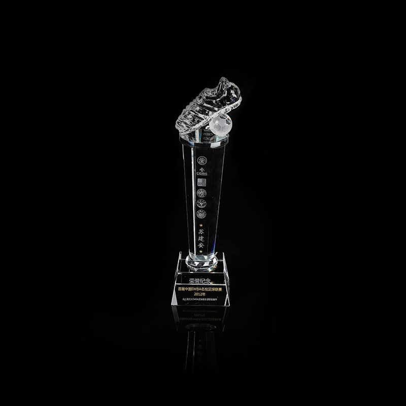
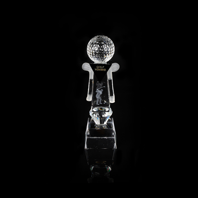
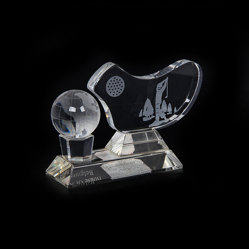
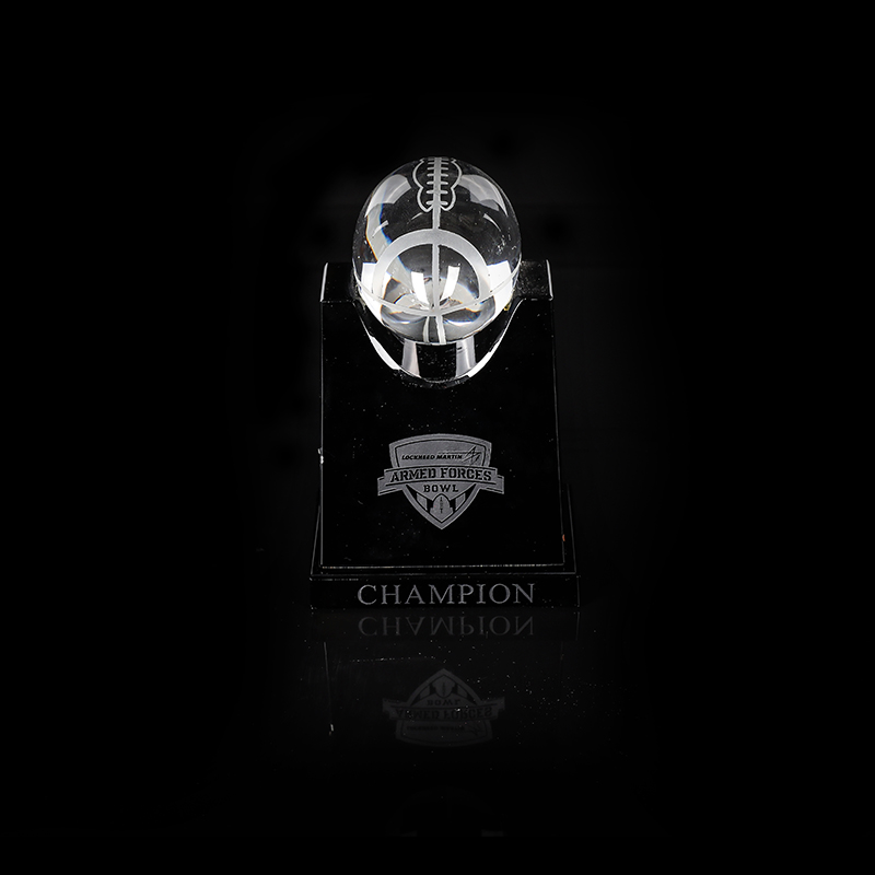
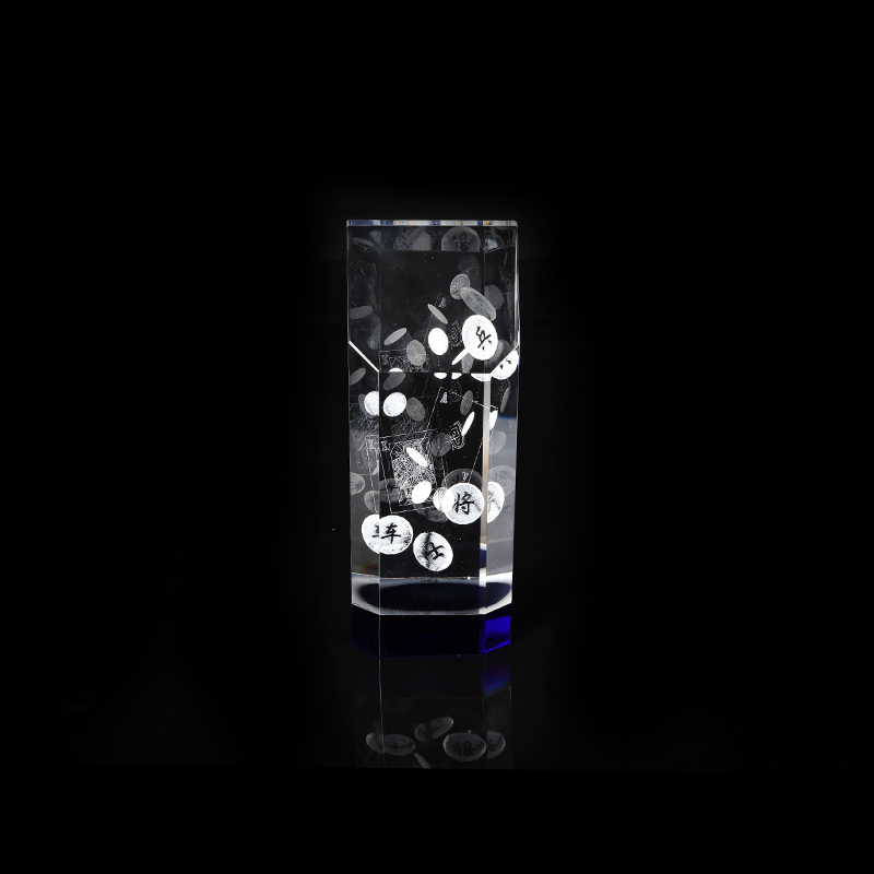
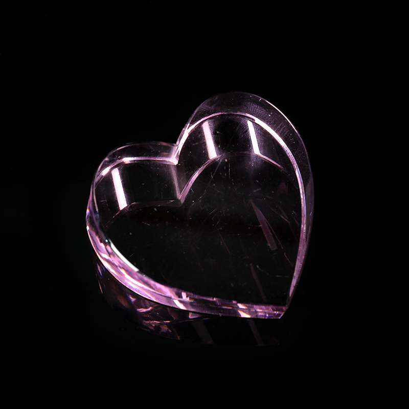
عربىCrystal pyramids, such as the Angelite Pyramid, bring a sense of clarity and proportion to a space, but their visual impact is often shaped by the colors and materials around them. Many people focus on how light moves through each facet, yet the surrounding palette plays a significant role in defining the atmosphere of a display. Whether you have placed your pyramid alongside a Crystal Cube Laser or a Crystal Glass Medal, learning to coordinate colors can help highlight the piece without overwhelming it.
This approach doesn’t require an elaborate interior redesign. Even subtle adjustments to backdrop, lighting color, or nearby objects can change how a pyramid looks from different angles. By understanding a few practical principles, you can create arrangements that feel cohesive and draw attention to the qualities you value most.
The Influence of Background Colors on Transparency
One of the easiest ways to change how a crystal pyramid appears is by modifying the color behind it. Light-colored backgrounds, such as pale gray or soft white, tend to emphasize clarity and create subtle shadows that define the pyramid’s edges. This approach can be effective when displaying pieces with high transparency or internal etching, as often seen in Crystal Cube Laser designs.
Darker backgrounds can create a stronger contrast, making the pyramid’s outline stand out sharply. However, they can also highlight fingerprints or dust more quickly. If you prefer a darker surface, consider materials with a matte finish to reduce glare and reflections that might distract from the crystal itself.
Selecting Accent Colors to Enhance Shape and Edges
Accent colors placed around or beneath a crystal pyramid can help draw attention to its geometry. Soft blues and greens often create a calming effect, while warmer tones like muted orange or burgundy can bring warmth to the overall arrangement.
If you want to highlight the edges, try placing a cloth or display base in a contrasting color. For example, a light-colored pyramid will often look more defined against a deeper tone. This combination helps emphasize the transition lines between each face without relying solely on lighting.
When pairing with other decorative objects, such as a Crystal Glass Medal, use colors that complement rather than match exactly. Small differences in tone can create depth and prevent a uniform look that feels static.
The Role of Lighting Temperature
The temperature of your lighting, measured in Kelvin, also affects how colors interact with crystal surfaces. Cool white lighting (around 5000K) tends to emphasize transparency and crisp edges, while warmer lighting (around 2700K) brings out subtle internal reflections and softer color shifts.
Adjustable lighting can be helpful when you want to explore different moods without moving the pyramid. For instance, you might use cooler light during the day to highlight clear surfaces and switch to warmer light in the evening to create a more inviting atmosphere.
If your arrangement includes a Crystal Cube Laser or Crystal Glass Medal, test how each piece responds to lighting temperature before finalizing placement. Some engravings or polished areas may reflect differently, and adjusting the angle of illumination can help balance the overall effect.
Combining Materials and Textures
Color isn’t the only element that shapes how a crystal pyramid looks. Surrounding materials and textures can also affect perception. Smooth surfaces, such as lacquered wood or polished metal, reflect light and can intensify brightness. Matte materials, like linen or unfinished stone, absorb more light and soften reflections.
Pairing the pyramid with a textured base or backdrop can help reduce glare while adding visual interest. For example, placing a pyramid on a subtle woven mat creates a contrast that highlights clean lines without distracting from the clarity of the material.
When combining with items like a Crystal Glass Medal, be mindful of competing reflections. A simple textured surface often supports the display without introducing too many light sources that can create visual clutter.
Adapting Color Combinations to Different Spaces
The environment where you display your pyramid influences which colors work effectively. In smaller spaces, lighter backgrounds and restrained accent colors can prevent the display from feeling crowded. In larger rooms, deeper colors and richer tones often help the pyramid stand out across a broader visual field.
If you plan to move your arrangement seasonally, consider how natural light changes the balance of color throughout the day. A color combination that feels subtle in morning light can become more pronounced by afternoon. Testing different options at various times helps you make adjustments that keep the display looking consistent.
Maintaining Clarity While Highlighting Color
Color can reveal fine dust or smudges more quickly, so regular maintenance supports the visual impact of your arrangement. Dust surfaces with a soft, lint-free cloth, and handle the pyramid carefully to prevent transferring oils from your hands.
When cleaning, use gentle, pH-neutral solutions applied sparingly, and dry with a separate microfiber cloth to prevent streaking. If your Crystal Cube Laser or Crystal Glass Medal is part of the display, clean all pieces at the same time to maintain a uniform appearance.